JHU Engineering Magazine redesign
DESIGN, ART DIRECTION, WEB DESIGN︎
Comprehensive redesign of Johns Hopkins University (JHU) Whiting School of Engineering’s magazine. From a complete reworking on the content structure, to a new visual language through revamped color and type palettes, to a fully-responsive website, the result is a reader experience that better represents the innovation and creativity of the school and it’s people.
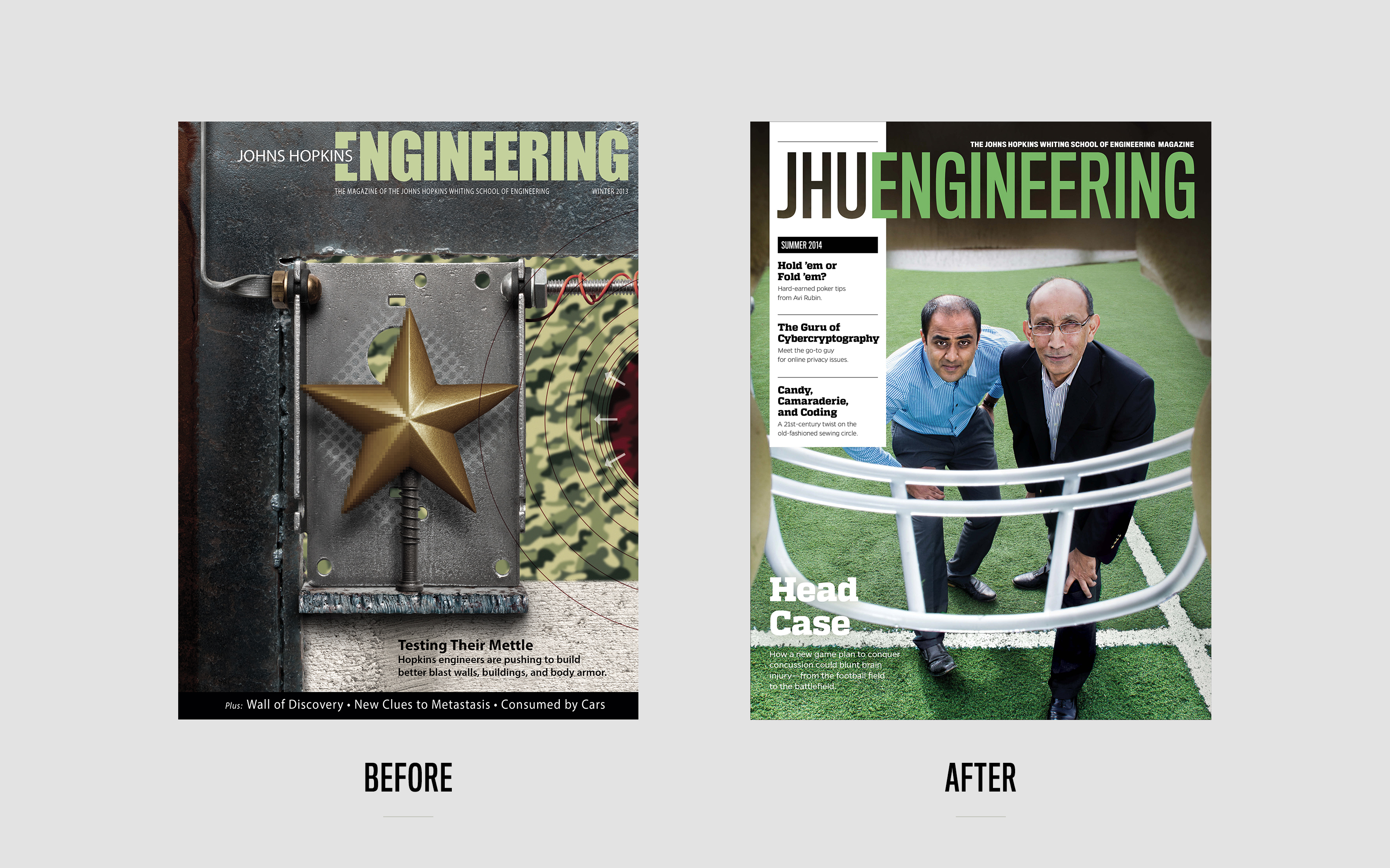
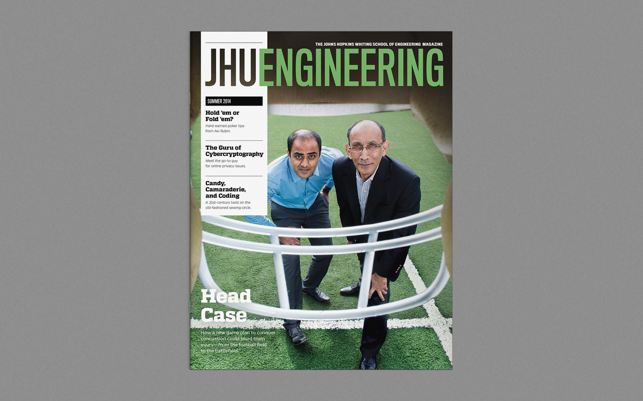
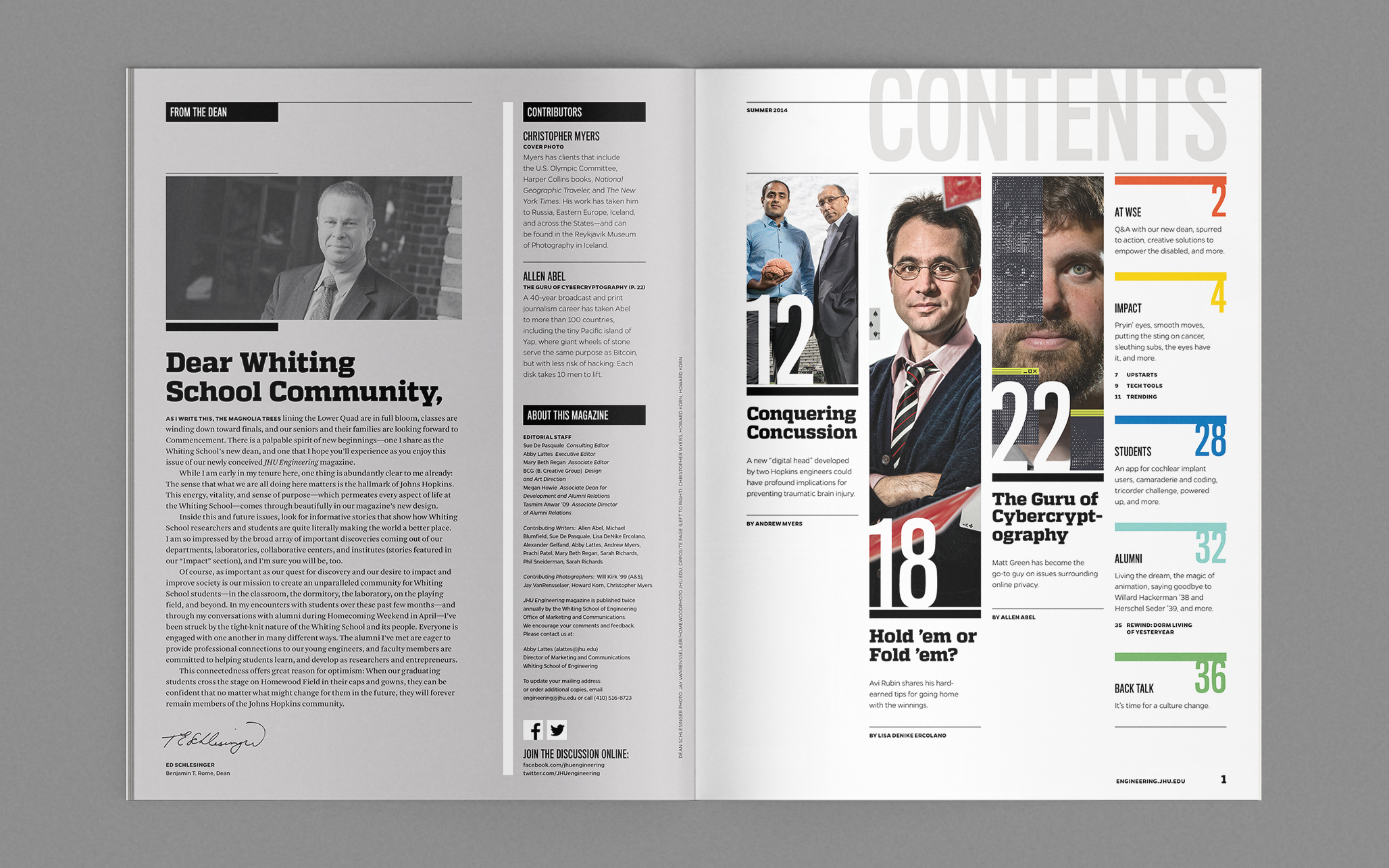
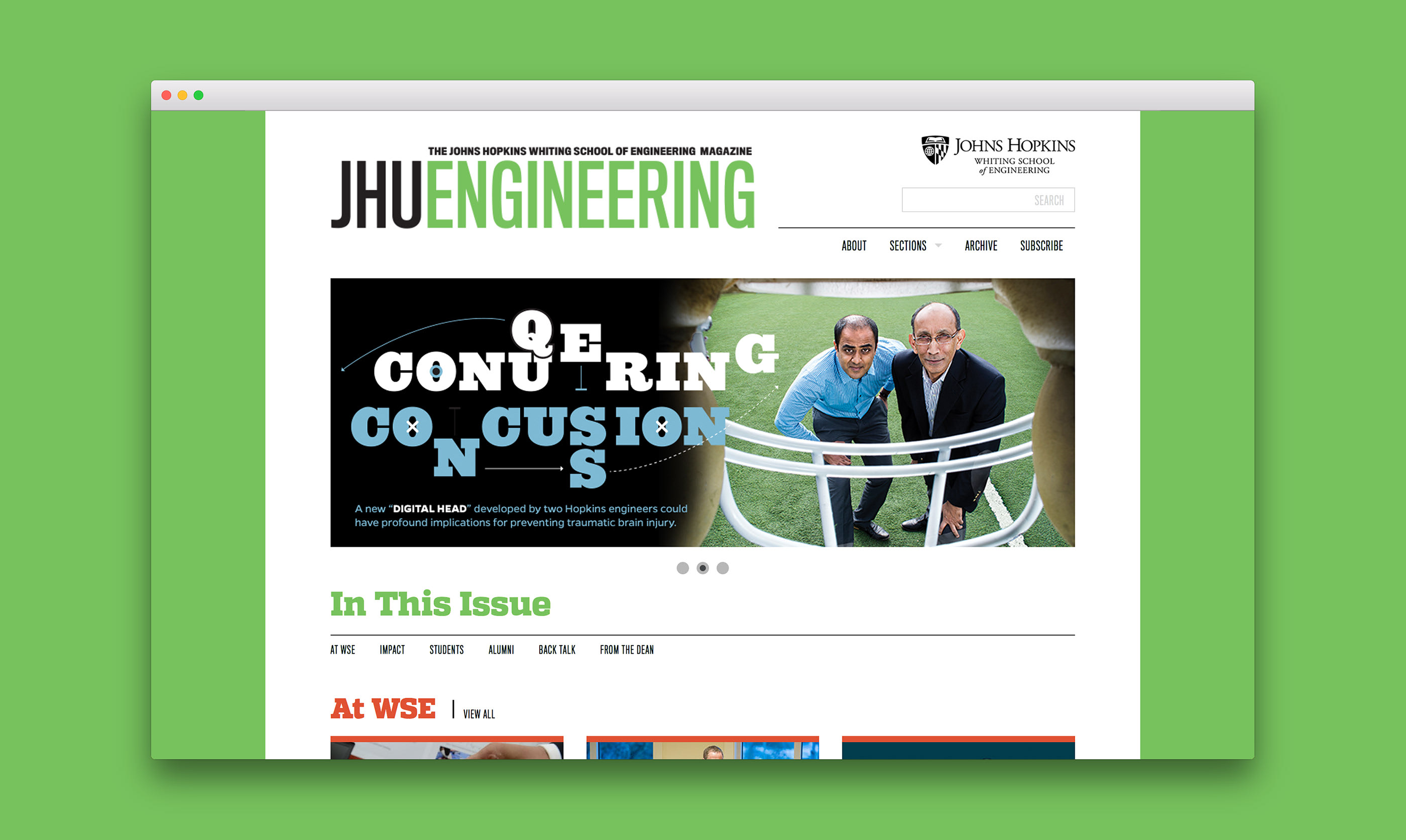
Cover Strategy To underscore the magazine’s relevance to the engineering world and journalistic excellence — as well as engage readers beyond the JHU Alumni circle — the masthead was overhauled to appeal to a broader tech-minded public. This design also promotes noteworthy stories in each issue more effectively, and accommodates diversity in cover art styles more easily.
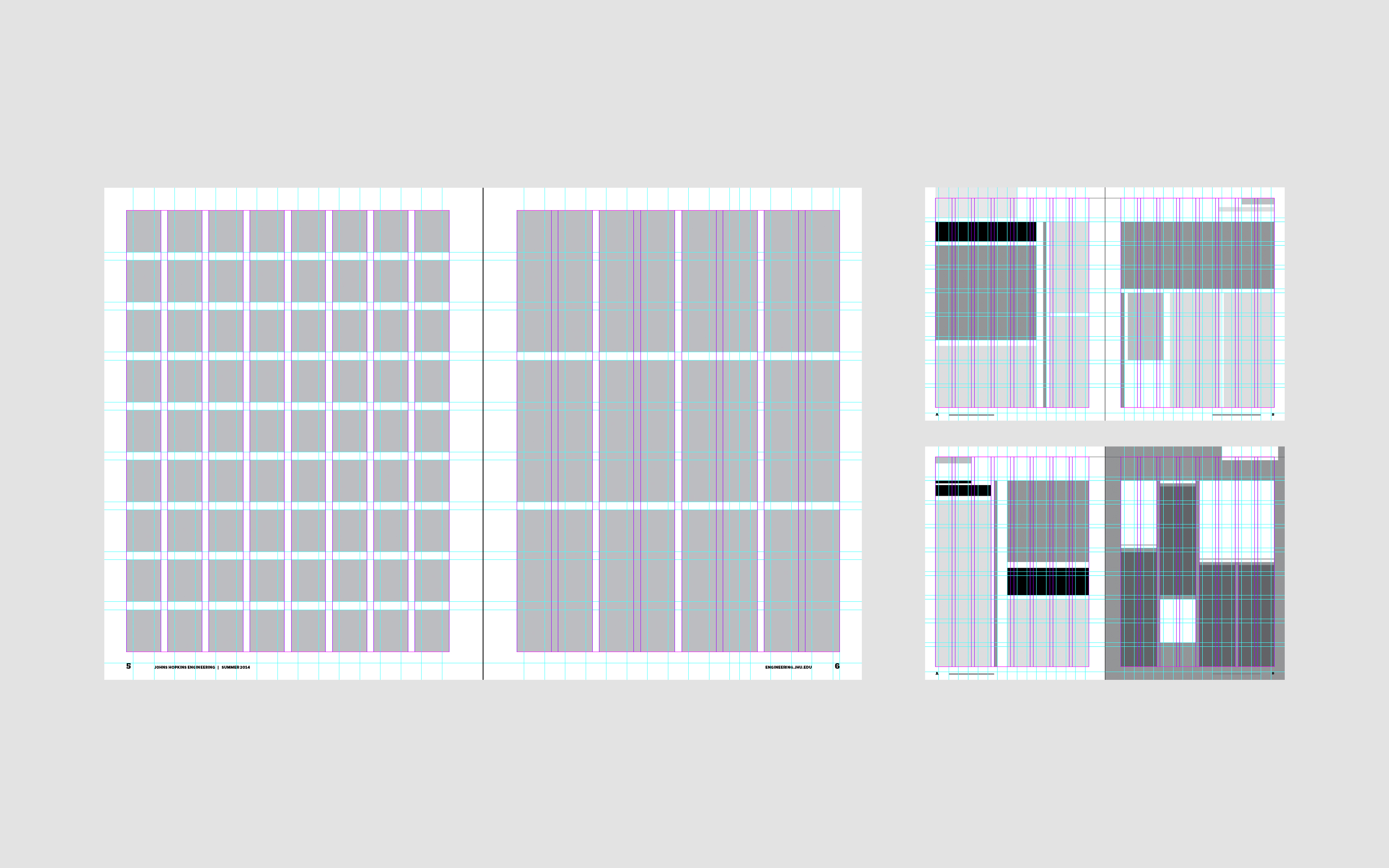
Grid Structure With a need to accommodate both short- and long-form content, a dynamic grid system provides overall layout consistency while allowing for flexibility in design and content hierarchy.
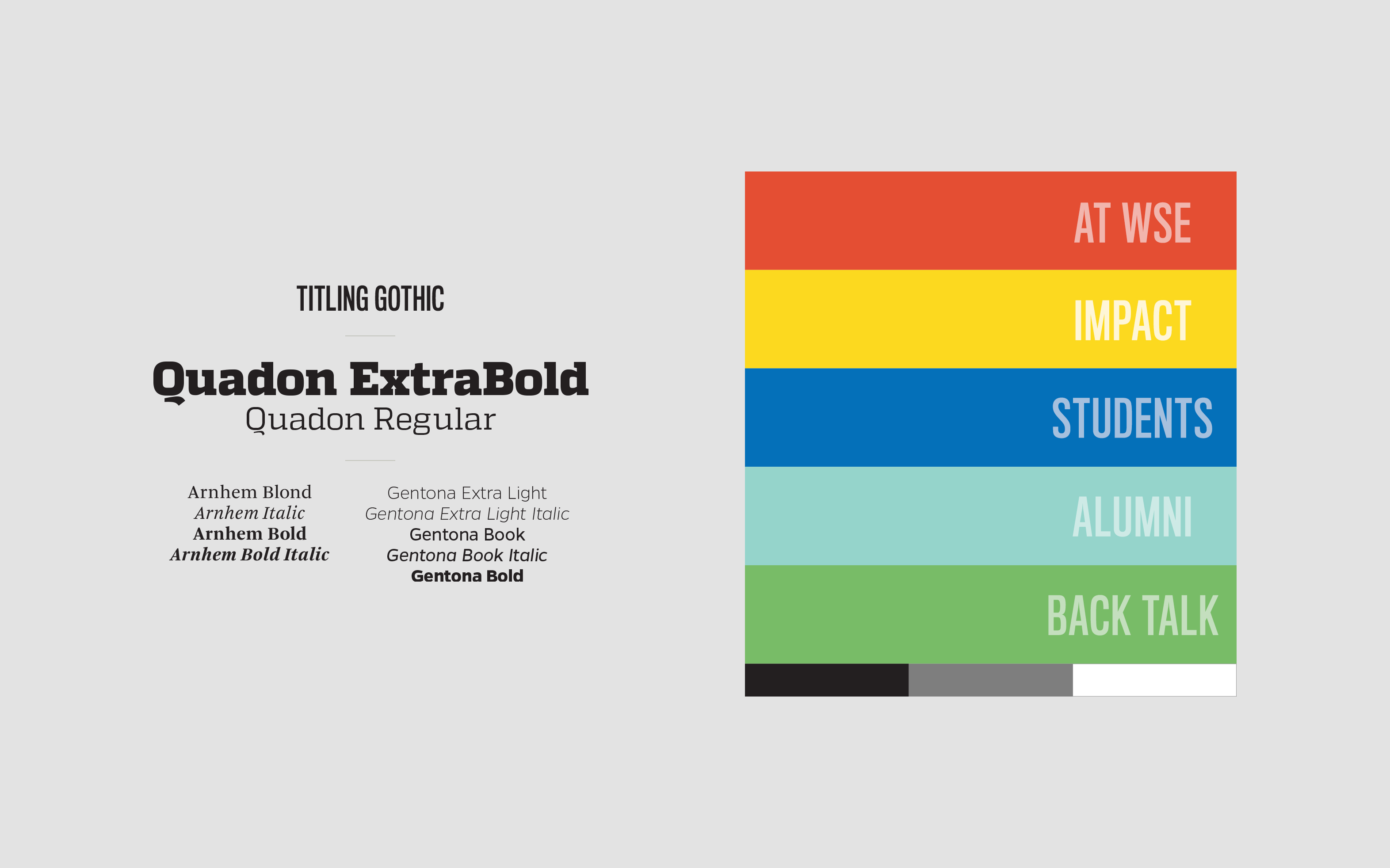

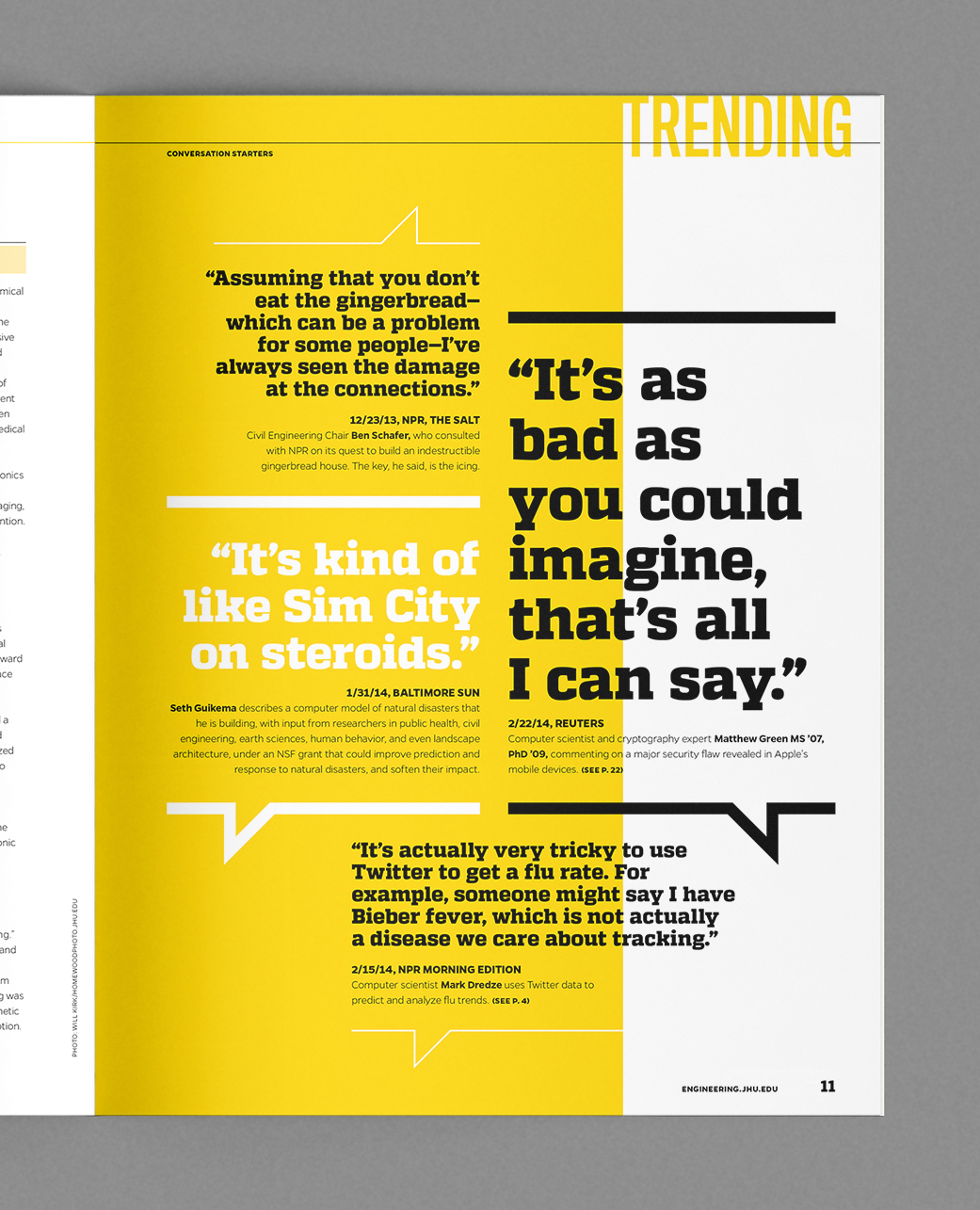
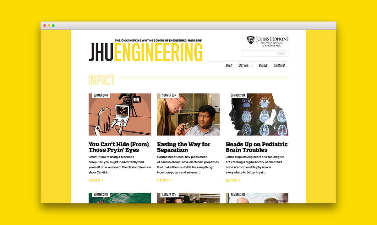
Type & color palettes An overarching rebrand of the university launched during the early stages of the redesign. To adhere to these new guidelines while still addressing the unique concerns of the existing publication, a curated type palette and color-coded content sections struck the perfect balance.


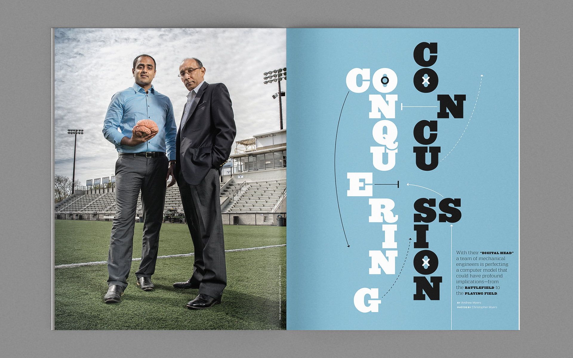


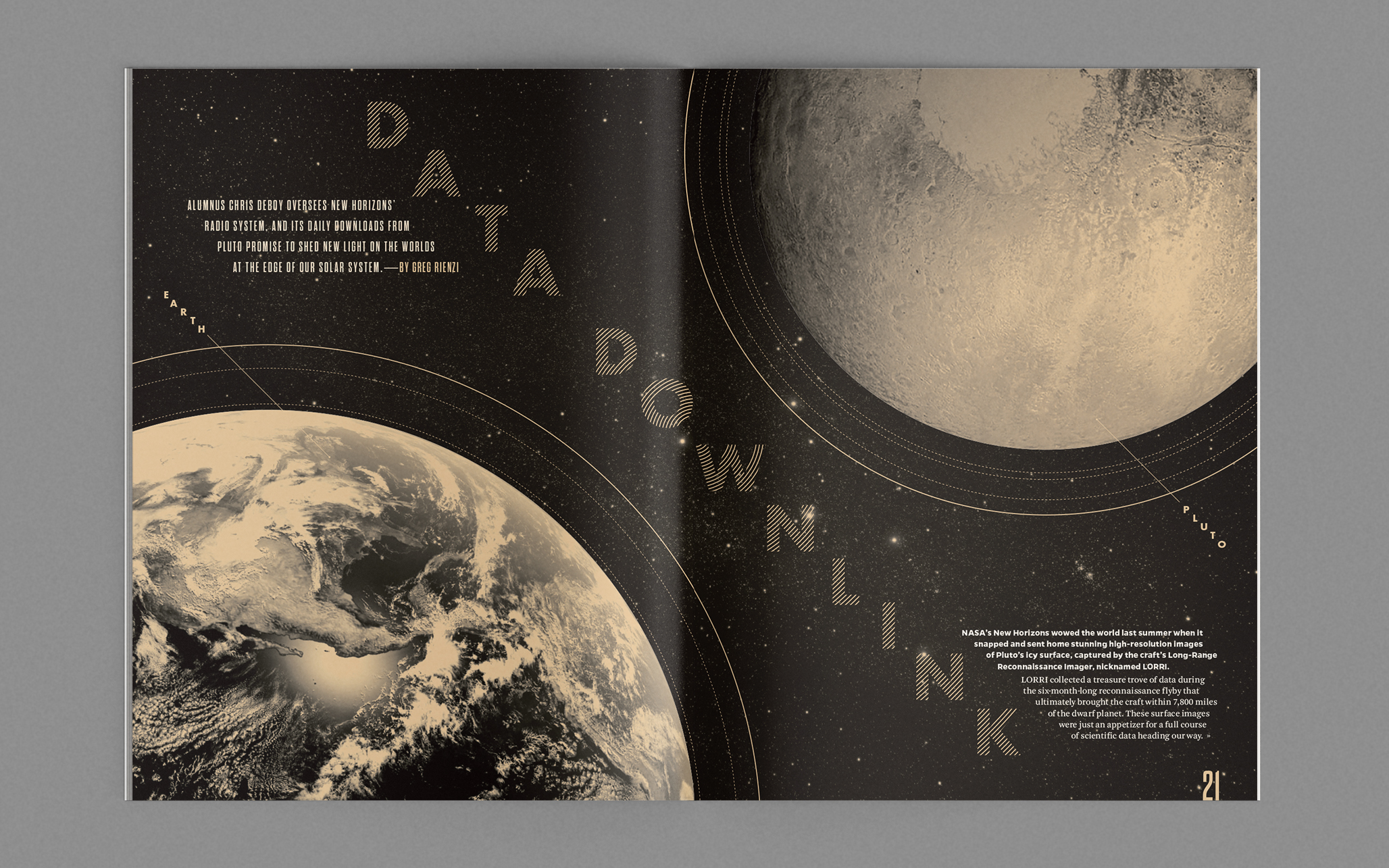
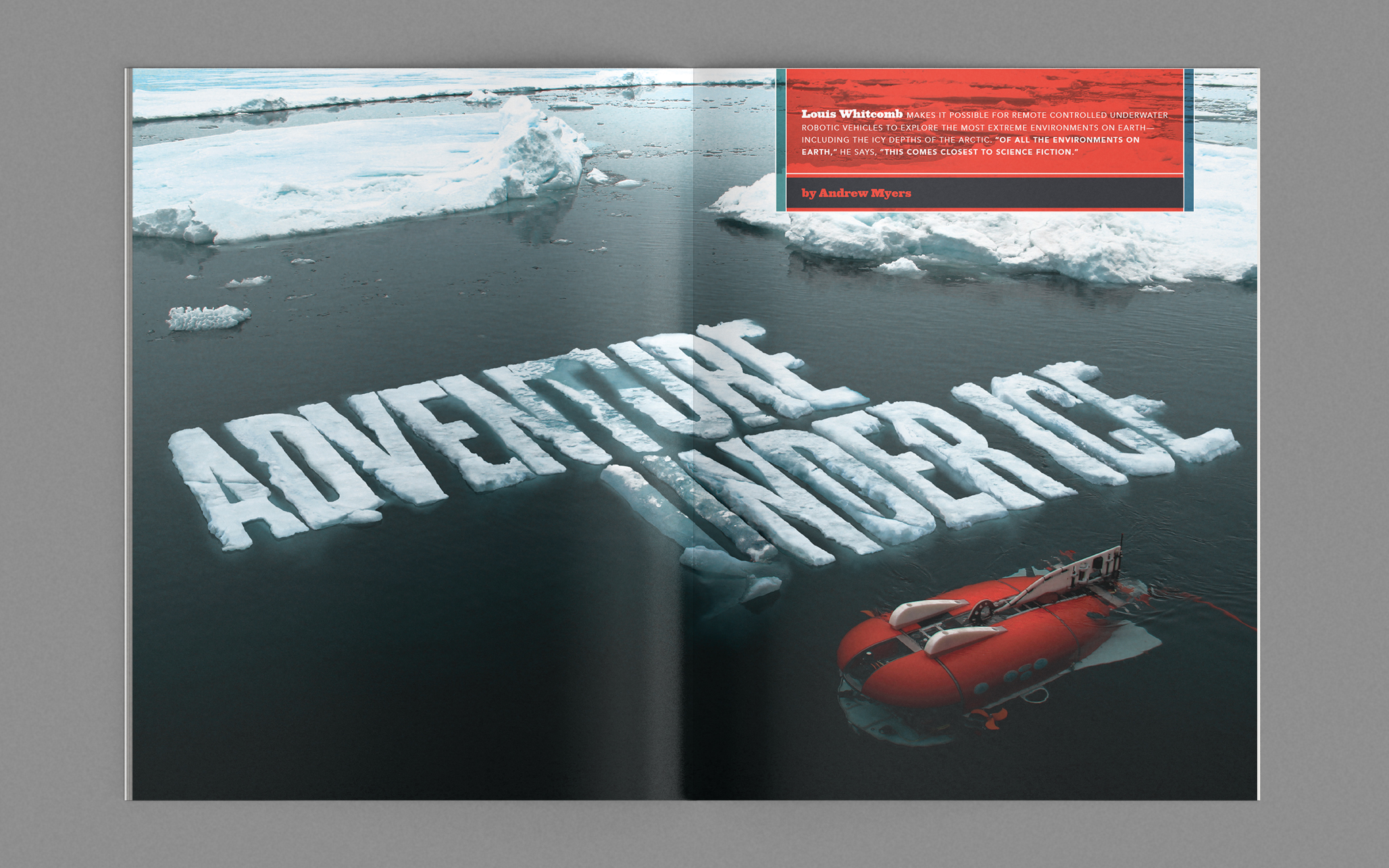
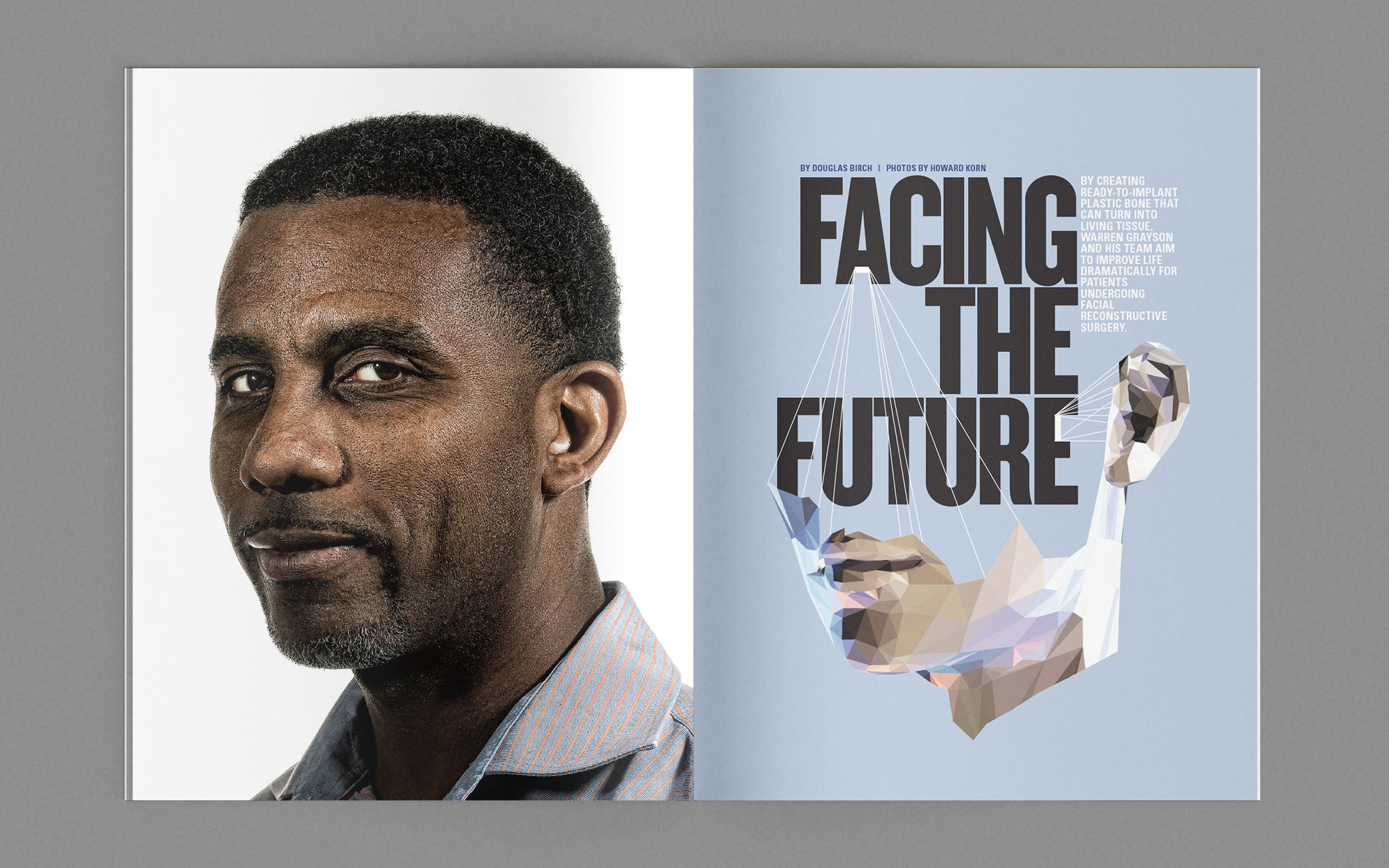
Features Various designs for the redesign launch and subsequent issues.

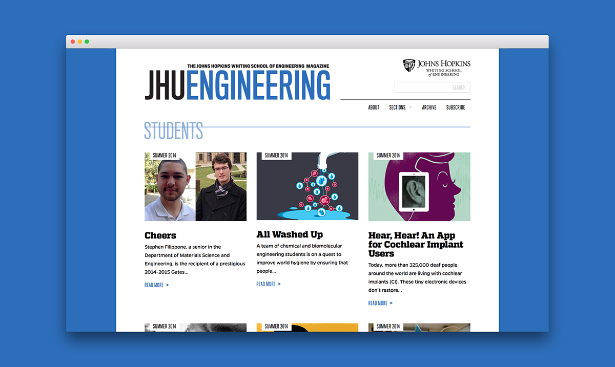
Website During the research phase, it was determined there was a fast-growing digital audience. A fully-responsive website was developed to bring a consistent, branded experience across desktop, tablet, and mobile devices.

Completed while employed at B. Creative Group (BCG); Editors: Abby Lattes, Sue DePasquale; Creative Direction: Greg Bennett; Photography: Will Kirk, Howard Korn, Christopher Myers; Co-designers: Sarah Yeager